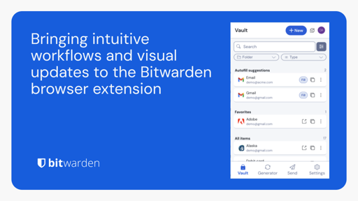
The update is great except for the new “fill” button. Before the update clicking anywhere in a tile would result in filling a form on a page. Now it’s a damn tiny button one must click to autofill a form. It’s extremely annoying.
Making it bigger would be nice
I find it more intuitive now that clicking on a card opens the details menu, but it’s hard to autofill now
The CTRL+SHIFT+L hotkey also stopped working for me, and I’m not sure yet if the issue is with Bitwarden, Firefox, or Zen. I’ll take a look again in a few days, but that should work as an alternative to the tiny button for me
It’s in the linked blog post for how you can disable this:
- Change the default behavior of clicking a vault item
To remove the new Fill button and have clicking anywhere on the vault item activate autofill, go to Settings > Autofill > Autofill suggestions and select Click items to autofill on Vault view
Account-wide? Or per-extension?
Agreed, that’s kind of an unnecessary pain point. Not the end of the world, but hopefully they continue to improve the UX and that unnecessary friction goes away :)
I’ve written a message regarding this to their support. They’d never know that this is bad if no one gives feedback.
Very true, that’s valuable feedback to provide. I should probably write a message as well, I’d only briefly noticed it yesterday as I was getting something done, so I didn’t really process the change until someone else mentioned they had that frustration
That fill button is THE WORST.
From another thread:
The only thing that really annoys me is the little notification things that pop up over the content. Like I have to wait to copy a password because it’s telling me I’ve just copied a username.
Oh and that it’s now pointlessly doubled the clicks, so to copy a username, instead of clicking the “copy username” icon, you have to click the “copy something” icon and then click “username”. So four clicks to use an entry that isn’t autofilled instead of two.
…
So for me the workflows aren’t particularly improved but I’m glad to see they’re trying to improve things.
Im on keepassxc i dont trust the internet with my passwords. I dont even trust my server.
The biggest concern I have with Keepass is if the database gets corrupted, I can’t access anything.
So I end up doing two different databases: one for everyday use and a second database for critical “identity” functions like banking, Google, etc.
I’m almost at the point of wondering if it needs some sort of text-based backups (json or something similar) that can be encrypted and backed up in multiple places.
Couldn’t you just make regular backups of your kdbx file?
The UI is different now, here are the notes about the changes


