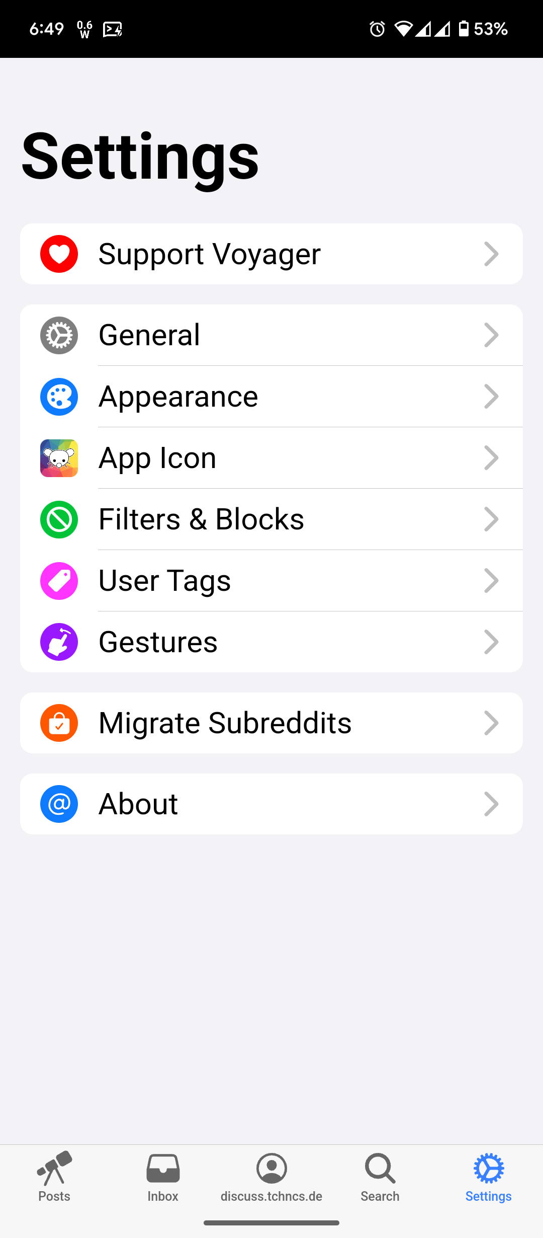
Well, I hope the icons are recolored to work both on light and dark themes.
I’m using the web app and this is applies to both Apple and Android designs
This means your android system web view is very outdated and doesn’t support display p3 colors. You should update because it’s a big security risk.
I see, that makes sense
This should be wayyy further up top. Too bad commenting for visibility doesn’t work here.
100% this. Your android version is way out of date, huge security risk.
I work in forensics, people don’t just say it’s a security risk for fun, it really is a large security risk. Try update asap if you can.

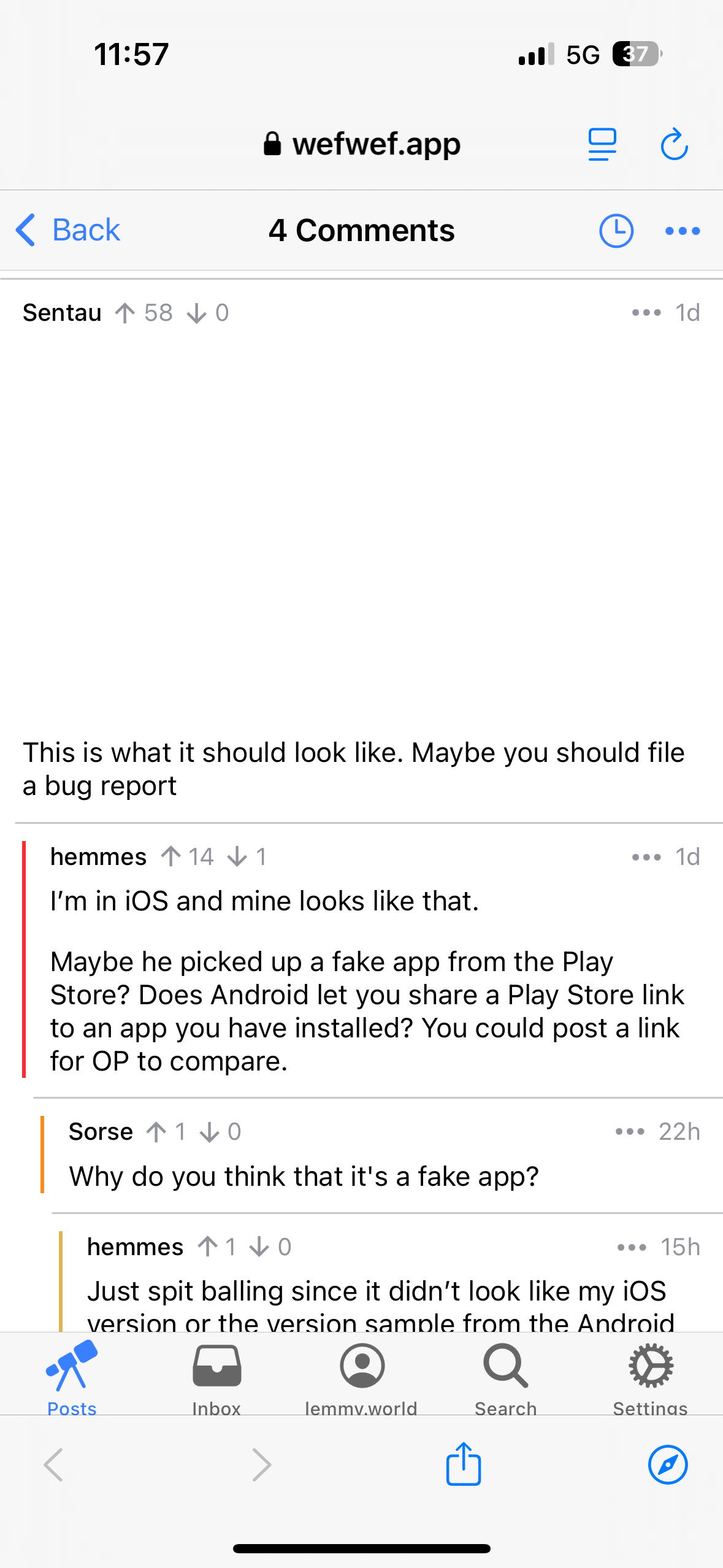
This is what it should look like. Maybe you should file a bug report
I’m in iOS and mine looks like that.
Maybe he picked up a fake app from the Play Store? Does Android let you share a Play Store link to an app you have installed? You could post a link for OP to compare.
He mentions using the web app. Maybe the browser being used is not rendering stuff properly
that’s not actually a common issue…
Is that a apple thing?
Why do you think that it’s a fake app?
Just spit balling since it didn’t look like my iOS version or the version sample from the Android user above. But someone else said he may be using a web app version which I had completely forgotten about.

LOL perfect time for a bug to show up
Lol
Always have been
I can’t reproduce this in the web app at https://vger.app/. All settings icons have a colored circle around them.
I just learned there’s a light mode
Who cares about light mode?? The dark side has cookies!
I appreciate your joke.
Dark mode is not accessible for everyone unfortunately
Genuinely curious, why not?
They dont know how to use brower extensions or how turn turn dark mode on in the OS
I guess “accessible” could mean that, but it sounded to me like an impairment or something. Virtually anyone who wants to use dark mode can do a web search for how-to and do it /shrug
Not everybody lives in their parents’ basement.
There are studies that found that dark mode can cause more eye strain, specially in bright environments.Source? I call bullshit on that, like red wine both causes and prevents cancer
I’m almost certain I once saw one such study, but couldn’t find it anymore, so yes, feel free to file my claim as bullshit.
What I did find was some articles about a problem called halation in which people with astigmatism or propensity for it can have the eyes dilate too much with dark mode making white-on-dark text illegible.
I would laugh my ass off if they were using IPS displays. OLED does not have this issue
I also call bullshit. Light mode physically hurts my eyes any time it creeps in.
I’m almost certain I once saw one such study, but couldn’t find it anymore, so yes, feel free to file my claim as bullshit.
What I did find was some articles about a problem called halation in which people with astigmatism or propensity for it can have the eyes dilate too much with dark mode making white-on-dark text illegible.
I appreciate this response. Good on you for owning that. I’ve had the same experience (with other topics). It makes me feel like either I’m going crazy or search engines are awful. “Why can’t I find that article?!”
That is exactly the disadvantage of dark mode: your eyes would adjust for low light so something bright would mess your eyes up like a pilot at night being shone a laser pointer. That’s also why pure white text over pure black is actually worse than simply light mode with comfortable brightness.
Yeah I’m sorry I’m not buying the argument “staring at a light bulb hours a day is better, because occasionally some asshole will flash one in your face against your will anyway”.
If I didn’t use dark mode in bed as one example, I would be exposed to light 10 times brighter and it would fuck with my circadian rhythm hard. But because I use dark mode, I’m able to fall asleep easily after using my phone.
I’m talking about eye strain and light mode, shockingly, isn’t a light bulb unless you have your brightness on max all the time.
Any cool light can disrupt your circadian rhythm. While dark mode is definetly helpful on that aspect, sepia tone is also as helpful if you don’t prefer dark mode.
Light mode with brightness all the way down or otherwise is horrible on my eyes. Decades of experience tell me that
And yes I already know about the color temperature aspect and have adjusted accordingly. It’s definitely the more important issue how much light you’re getting though. Dark mode on full brightness is probably similar to light mode on 10% brightness
Someone didn’t bother to test their design, dang.


